
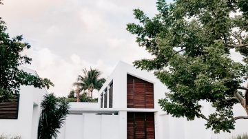
Apple's stock rout starts and ends with the iPhone
This is a wider card with supporting text below as a natural lead-in to additional content. A small river flows by their place and ...

This is a wider card with supporting text below as a natural lead-in to additional content. A small river flows by their place and ...

This is a wider card with supporting text below as a natural lead-in to additional content. A small river flows by their place and ...
This is a wider card with supporting text below as a natural lead-in to additional content. A small river flows by their place and ...
                  <!-- block start -->
                  <div class="block-area">
                    <!-- block title -->
                    <div class="block-title-6">
                      <h4 class="h5 border-primary">
                        <span class="bg-primary text-white">Latest news</span>
                      </h4>
                    </div>
                    <!-- block content -->
                    <div class="border-bottom-last-0 first-pt-0">
                      <!--post start-->
                      <article class="card card-full hover-a py-4">
                        <div class="row">
                          <div class="col-sm-6 col-md-12 col-lg-6">
                            <!--thumbnail-->
                            <div class="ratio_360-202 image-wrapper">
                              <a href="#">
                                <img class="img-fluid lazy" src="../../assets/img/assets/lazy-empty.png" data-src="../../assets/img/360x202/img17.jpg" alt="Image description">
                              </a>
                            </div>
                          </div>
                          <div class="col-sm-6 col-md-12 col-lg-6">
                            <div class="card-body pt-3 pt-sm-0 pt-md-3 pt-lg-0">
                              <!--title-->
                              <h3 class="card-title h2 h3-sm h2-md">
                                <a href="#">Apple's stock rout starts and ends with the iPhone</a>
                              </h3>
                              <!--author and date-->
                              <div class="card-text mb-2 text-muted small">
                                <span class="d-none d-sm-inline me-1">
                                  <a class="fw-bold" href="#">John Doe</a>
                                </span>
                                <time datetime="2019-10-21">Oct 21, 2019</time>
                              </div>
                              <!--description-->
                              <p class="card-text">This is a wider card with supporting text below as a natural lead-in to additional content. A small river flows by their place and ...</p>
                            </div>
                          </div>
                        </div>
                      </article>
                      <!--post start-->
                      <article class="card card-full hover-a py-4">
                        <div class="row">
                          <div class="col-sm-6 col-md-12 col-lg-6">
                            <!--thumbnail-->
                            <div class="ratio_360-202 image-wrapper">
                              <a href="#">
                                <img class="img-fluid lazy" src="../../assets/img/assets/lazy-empty.png" data-src="../../assets/img/360x202/img18.jpg" alt="Image description">
                              </a>
                            </div>
                          </div>
                          <div class="col-sm-6 col-md-12 col-lg-6">
                            <div class="card-body pt-3 pt-sm-0 pt-md-3 pt-lg-0">
                              <!--title-->
                              <h3 class="card-title h2 h3-sm h2-md">
                                <a href="#">Want the best Black Friday deals? Head to a department store</a>
                              </h3>
                              <!--author and date-->
                              <div class="card-text mb-2 text-muted small">
                                <span class="d-none d-sm-inline me-1">
                                  <a class="fw-bold" href="#">John Doe</a>
                                </span>
                                <time datetime="2019-10-21">Oct 21, 2019</time>
                              </div>
                              <!--description-->
                              <p class="card-text">This is a wider card with supporting text below as a natural lead-in to additional content. A small river flows by their place and ...</p>
                            </div>
                          </div>
                        </div>
                      </article>
                      <!--post start-->
                      <article class="card card-full hover-a py-4">
                        <div class="row">
                          <!--start thumbnail-->
                          <div class="col-sm-6 col-md-12 col-lg-6">
                            <!--thumbnail-->
                            <div class="ratio_360-202 image-wrapper">
                              <a href="#">
                                <img class="img-fluid lazy" src="../../assets/img/assets/lazy-empty.png" data-src="../../assets/img/360x202/img14.jpg" alt="Image description">
                              </a>
                            </div>
                          </div>
                          <div class="col-sm-6 col-md-12 col-lg-6">
                            <div class="card-body pt-3 pt-sm-0 pt-md-3 pt-lg-0">
                              <!--title-->
                              <h3 class="card-title h2 h3-sm h2-md">
                                <a href="#">5 Tips to Save Money Booking Your Next Hotel Room</a>
                              </h3>
                              <!--author and date-->
                              <div class="card-text mb-2 text-muted small">
                                <span class="d-none d-sm-inline me-1">
                                  <a class="fw-bold" href="#">John Doe</a>
                                </span>
                                <time datetime="2019-10-21">Oct 21, 2019</time>
                              </div>
                              <!--description-->
                              <p class="card-text">This is a wider card with supporting text below as a natural lead-in to additional content. A small river flows by their place and ...</p>
                            </div>
                          </div>
                        </div>
                      </article>
                    </div>
                  </div>
                  <!--End Block-->
This is a wider card with supporting text below as a natural lead-in to additional content. A small river flows by their place and ...
Read more
This is a wider card with supporting text below as a natural lead-in to additional content. A small river flows by their place and ...
Read more
This is a wider card with supporting text below as a natural lead-in to additional content. A small river flows by their place and ...
Read moreThis block component is same like block content 4, just add block color in block-area classes
                  <!-- Block start -->
                  <div class="block-area block-info">
                  ....
                  ....
                  </div>
                  <!--End Block-->
This is a wider card with supporting text below as a natural lead-in to additional content. A small river flows by their place and ...
This is a wider card with supporting text below as a natural lead-in to additional content. A small river flows by their place and ...
This is a wider card with supporting text below as a natural lead-in to additional content. A small river flows by their place and ...
                        <!-- block start -->
                        <div class="block-area">
                          <!-- block title -->
                          <div class="block-title-6">
                            <h4 class="h5 border-primary">
                              <span class="bg-primary text-white">Latest news</span>
                            </h4>
                          </div>
                          <!-- block content -->
                          <div class="border-bottom-last-0 first-pt-0">
                            <!--post start-->
                            <article class="card card-full hover-a py-4">
                              <div class="row">
                                <div class="col-sm-6 col-md-12">
                                  <!--thumbnail-->
                                  <div class="ratio_360-202 image-wrapper">
                                    <a href="#">
                                      <img class="img-fluid lazy" src="../../assets/img/assets/lazy-empty.png" data-src="../../assets/img/360x202/img17.jpg" alt="Image description">
                                    </a>
                                  </div>
                                </div>
                                <div class="col-sm-6 col-md-12">
                                  <div class="card-body pt-3 pt-sm-0 pt-md-3">
                                    <!--title-->
                                    <h3 class="card-title h2 h3-sm h2-lg">
                                      <a href="#">Apple's stock rout starts and ends with the iPhone</a>
                                    </h3>
                                    <!--author and date-->
                                    <div class="card-text mb-2 text-muted small">
                                      <span class="d-none d-sm-inline me-1">
                                        <a class="fw-bold" href="#">John Doe</a>
                                      </span>
                                      <time datetime="2019-10-21">Oct 21, 2019</time>
                                    </div>
                                    <!--description-->
                                    <p class="card-text">This is a wider card with supporting text below as a natural lead-in to additional content. A small river flows by their place and ...</p>
                                  </div>
                                </div>
                              </div>
                            </article>
                            <!--post start-->
                            <article class="card card-full hover-a py-4">
                              <div class="row">
                                <div class="col-sm-6 col-md-12">
                                  <!--thumbnail-->
                                  <div class="ratio_360-202 image-wrapper">
                                    <a href="#">
                                      <img class="img-fluid lazy" src="../../assets/img/assets/lazy-empty.png" data-src="../../assets/img/360x202/img18.jpg" alt="Image description">
                                    </a>
                                  </div>
                                </div>
                                <div class="col-sm-6 col-md-12">
                                  <div class="card-body pt-3 pt-sm-0 pt-md-3">
                                    <!--title-->
                                    <h3 class="card-title h2 h3-sm h2-lg">
                                      <a href="#">Want the best Black Friday deals? Head to a department store</a>
                                    </h3>
                                    <!--author and date-->
                                    <div class="card-text mb-2 text-muted small">
                                      <span class="d-none d-sm-inline me-1">
                                        <a class="fw-bold" href="#">John Doe</a>
                                      </span>
                                      <time datetime="2019-10-21">Oct 21, 2019</time>
                                    </div>
                                    <!--description-->
                                    <p class="card-text">This is a wider card with supporting text below as a natural lead-in to additional content. A small river flows by their place and ...</p>
                                  </div>
                                </div>
                              </div>
                            </article>
                            <!--post start-->
                            <article class="card card-full hover-a py-4">
                              <div class="row">
                                <!--start thumbnail-->
                                <div class="col-sm-6 col-md-12">
                                  <!--thumbnail-->
                                  <div class="ratio_360-202 image-wrapper">
                                    <a href="#">
                                      <img class="img-fluid lazy" src="../../assets/img/assets/lazy-empty.png" data-src="../../assets/img/360x202/img14.jpg" alt="Image description">
                                    </a>
                                  </div>
                                </div>
                                <div class="col-sm-6 col-md-12">
                                  <div class="card-body pt-3 pt-sm-0 pt-md-3">
                                    <!--title-->
                                    <h3 class="card-title h2 h3-sm h2-lg">
                                      <a href="#">5 Tips to Save Money Booking Your Next Hotel Room</a>
                                    </h3>
                                    <!--author and date-->
                                    <div class="card-text mb-2 text-muted small">
                                      <span class="d-none d-sm-inline me-1">
                                        <a class="fw-bold" href="#">John Doe</a>
                                      </span>
                                      <time datetime="2019-10-21">Oct 21, 2019</time>
                                    </div>
                                    <!--description-->
                                    <p class="card-text">This is a wider card with supporting text below as a natural lead-in to additional content. A small river flows by their place and ...</p>
                                  </div>
                                </div>
                              </div>
                            </article>
                          </div>
                        </div>
                        <!--End Block-->